How to Test Paint Color Before Painting

That soft greige looked perfect on your phone, then turned lavender on the wall by 4 p.m. That is exactly why it pays to test paint color before painting instead of relying on a tiny chip, a product photo, or the store lighting. Color changes with exposure, sheen, room size, and even what is sitting next to it, so sampling is not a small extra step. It is what keeps a good project from turning into a repaint.
For homeowners, that means fewer expensive surprises. For painters, renovators, and contractors, it means better approvals, fewer callbacks, and a smoother job from estimate to final coat. The goal is not just to pick a nice color. The goal is to choose the right color in the actual space where it has to perform.
Why paint samples go wrong
Most color-testing mistakes are simple. The sample is too small, it is brushed onto the wrong wall, or it is checked once under overhead lighting and called done. Then the full room gets painted and the color suddenly reads too dark, too cool, too flat, or far brighter than expected.
Paint color is highly reactive to context. A north-facing room can mute warm tones and make cool colors feel colder. South-facing rooms usually pull more warmth and brightness. Strong flooring, cabinets, countertops, brick, wallpaper, and trim can all shift how a color is perceived. Sheen matters too. Eggshell and satin reflect light differently than flat, and that changes how depth and undertone show up.
One more detail gets overlooked all the time: scale. A color on a 2-inch chip is not the same color experience as that same color spread across four full walls. Bigger coverage amplifies undertones and saturation, which is why some colors feel completely different once they are painted at room scale.
How to test paint color before painting the right way
If you want an accurate read, start with two or three strong candidates, not ten. Too many options make comparisons muddy and slow the decision down. Narrow your shortlist first by looking at the fixed elements in the room – flooring, stone, tile, cabinetry, furniture, and trim color.
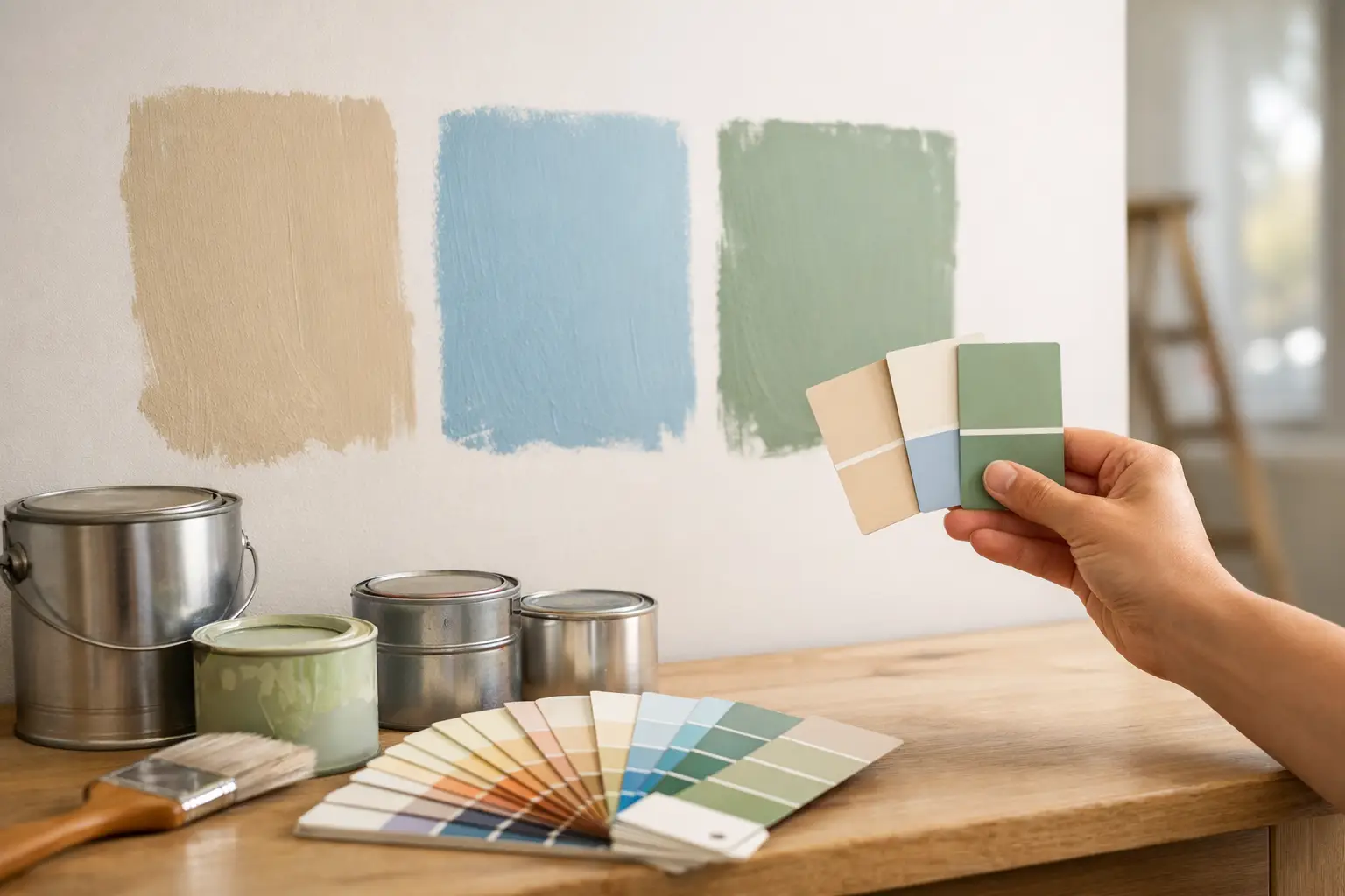
Once you have your contenders, sample them large enough to judge properly. A small patch is rarely enough. You want a generous sample area so you can see body, undertone, and light response. If you are painting directly on the wall, place each sample in separate sections of the room rather than clustering them together. That keeps one color from visually affecting another.
If you do not want to mark up the surface yet, paint sample boards instead. This is often the cleaner option for finished rooms, client approvals, or jobs where the existing wall color could distort the sample. Move the board around the space and check it against every major surface.
Test more than one wall
A single wall does not tell the whole story. In most rooms, the light changes from wall to wall. One area may be washed in daylight while another stays shaded for most of the day. Test the color on at least two walls, ideally with different light exposure.
This matters even more in open-concept layouts. A paint color that works in the kitchen may shift noticeably when viewed from the dining area or living room. If the room opens into a hallway or adjacent space, step back and assess the transition. Color rarely lives in isolation.
Check morning, afternoon, and evening light
A paint sample should be viewed at multiple times of day. Morning light can be cooler and clearer. Afternoon sun may intensify warmth. Evening lighting introduces the artificial side of the equation, which is often where homeowners get caught off guard.
Warm LEDs, cool LEDs, recessed lighting, sconces, pendants, and lamps all influence color. If the room lighting is changing as part of the project, test under the bulbs you actually plan to use. A wall color approved under old lighting may feel off once the fixtures are updated.
What to compare before you commit
The best sample test is not just about whether you “like” a color. It is about whether it works with the space, the finish, and the project requirements.
Look at the undertone first. A beige may lean pink, yellow, green, or gray. A white may read creamy, blue, or stark. Even a charcoal can shift warm or cool depending on the surrounding materials. If something feels wrong but you cannot explain why, the undertone is usually the reason.
Then look at value – how light or dark the color feels in the room. Many people choose a sample because it looks subtle on the chip, then realize it is too deep when spread across the wall. Others pick a pale neutral that disappears under strong daylight and leaves the room feeling unfinished. What you want is balance: enough contrast to define the space, but not so much that the room becomes heavy or washed out.
Finally, think about finish and use. A family entry, kitchen, bath, rental unit, or commercial space may need greater washability and durability than a low-traffic bedroom. Testing the right color without choosing the right product and sheen can still leave you with the wrong result.
Common sampling mistakes to avoid
The fastest way to get bad information from a paint sample is to paint it over an unprepared surface. If the wall is dark, stained, glossy, or patched, the sample may not read true. Primer can make a real difference, especially when testing lighter colors over strong existing paint.
Another mistake is brushing on one thin coat and making a decision too early. Many colors need full coverage to show accurately. Follow the sample product directions and let it dry properly before judging the result. Wet paint almost always looks different from dry paint.
It is also risky to choose color under one light source or from one angle. Walk into the room, then out of it. View the sample close up and from across the room. Check it beside trim, flooring, furniture, and cabinetry. If you are testing for an exterior project, review the color in shade and full sun, and from the curb as well as up close.
When professionals test paint color before painting
Trade buyers often approach sampling with speed, but the same rules still apply. On occupied homes, client indecision can delay a schedule and lead to costly changes after walls are cut in. A disciplined sample process protects the timeline.
For contractors, sample boards are often the most efficient route. They are portable, presentable, and easy to review with clients on site. They also help when walls are not ready for paint or when multiple decision-makers need to sign off. If the job includes trim, doors, built-ins, or millwork, test those finishes separately. The same color can read differently across drywall, wood, and metal.
For larger projects, it is smart to confirm the full paint system at the same time – primer, topcoat, and sheen. Color approval is only one part of the final result. Coverage, touch-up performance, dry time, and durability matter just as much when the project has to move efficiently and look consistent at handoff.
Choosing the sample that actually earns the job
If two colors feel close, pay attention to which one stays consistent throughout the day. The best choice is usually not the one that looks perfect for twenty minutes at noon. It is the one that holds up in changing light, works with the fixed finishes, and still feels right from the doorway.
That is where expert guidance helps. A reliable paint supplier can help narrow down undertones, recommend the right primer and finish, and make sure you are sampling with products that reflect the final result more accurately. For DIY customers, that means less guesswork. For professionals, it means fewer delays and better client confidence.
At Oui Colour Paint, that support is part of the value – along with premium brands, broad inventory, and the tools needed to move from sample to final coat without chasing products across multiple suppliers.
Before you open a full gallon, give the color a fair test. A little patience at the sample stage is often what makes the finished room look intentional, polished, and right the first time.