


Choosing Paint Colors That Match Canadian Heritage Homes

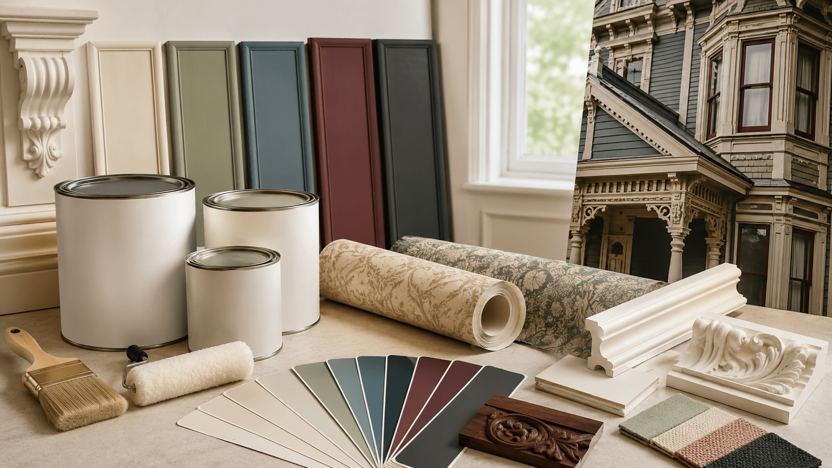
Choosing paint colours for a Canadian heritage home can feel exciting and slightly stressful at the same time. These homes have personality. A Victorian porch, old brick exterior, carved trim, tall windows, original stair rail, or detailed front door already tells a story. The goal is not to cover that up. The goal is to help those details look intentional, cared for, and still livable for a modern family.
That is where colour choice matters. A crisp black-and-white palette may look sharp on a new-build, but it can sometimes feel too harsh on an older Victorian, Edwardian, Queen Anne, or early twentieth-century Canadian home. On the other hand, going too “historic” can make the house feel dark, heavy, or outdated.
The best approach sits somewhere in the middle. Respect the home’s original character, but choose colours that still feel fresh, warm, and practical for everyday life. Before committing to a final shade, it is also worth reviewing how to test paint color before painting so you can see how the colour behaves in real daylight, shade, and evening light.
Why Heritage Homes Need a Different Color Strategy
Heritage homes are not blank boxes. They usually have more architectural detail than newer homes, which means the paint colours have more work to do.
A newer house might rely on clean lines, smooth siding, and a simple palette. A heritage home often has layered trim, porch columns, decorative brackets, bay windows, gables, brickwork, wood siding, original doors, and old interior mouldings. If the colour is too flat, those details disappear. If the palette is too busy, the home can start looking chaotic.
For a DIY homeowner, the trick is to let the architecture guide the palette.
That means asking questions like:
- What material is already dominant: brick, wood, stone, or painted siding?
- Which details should stand out?
- Which areas should stay quiet?
- Does the home feel more Victorian and decorative, or more Edwardian and restrained?
- Is the exterior legally protected or located in a heritage district?
- Do the colours look right in Canadian light, including cloudy days and winter?
The Parks Canada Standards and Guidelines for the Conservation of Historic Places in Canada are a useful reference for understanding the broader idea of respecting heritage character. For homeowners, the simple takeaway is this: do not treat an older home like a generic surface. Work with what is already there.
Start by Understanding the Style of Your Home
Before choosing a colour, identify the style and materials of the house. You do not need to become an architectural historian, but even a basic understanding can prevent a lot of colour mistakes.
Victorian Homes
Victorian homes are often the most fun and the most intimidating to paint. They may have steep rooflines, decorative trim, bay windows, patterned brick, porches, brackets, and layered wood details.
These homes can usually handle more colour contrast than simpler houses. That does not mean every trim piece needs a different colour. It means you can use a thoughtful palette to highlight the craftsmanship.
Good Victorian-friendly colours include:
- Deep green
- Warm cream
- Muted burgundy
- Soft gold
- Slate blue
- Taupe
- Warm grey
- Charcoal accents
- Brick red
- Brown-black
A Victorian home can look beautiful with a three-part colour plan: one body colour, one trim colour, and one accent colour for the door or decorative details.
Edwardian and Early Twentieth-Century Homes
Edwardian homes are often more restrained than Victorian homes. They may still have charm and detail, but the overall look is usually cleaner and less ornate.
These homes often suit softer, calmer palettes, such as:
- Warm white
- Cream
- Sage
- Stone grey
- Olive
- Tan
- Soft black
- Deep blue
- Warm taupe
If a Victorian house can sometimes carry a dramatic colour story, an Edwardian home often looks best when the palette feels balanced and confident, not overly decorated.
Brick Heritage Homes
Many Canadian heritage homes have red, buff, brown, or mixed brick. In these cases, the brick should usually lead the colour decision.
The mistake many homeowners make is choosing paint colours in isolation. A colour may look perfect on a sample card but clash with the brick undertone once it is on the trim or door.
Red brick often pairs well with cream, warm white, olive, deep green, black, muted blue, taupe, and burgundy. Buff brick may work better with warm grey, soft sage, tan, charcoal, ivory, or muted brown.
If you are thinking about painting or coating masonry, review this guide on the best exterior paint for brick house walls before making a decision.
Exterior Heritage Color Palettes That Work in Canada
A good heritage palette usually has layers. You do not need ten colours. In most cases, you need three clear roles.
| Home Style or Material | Main Color Direction | Trim Color Direction | Door or Accent Color |
|---|---|---|---|
| Red brick Victorian | Warm cream, taupe, muted olive | Soft white, warm beige | Deep green, black, burgundy |
| Painted wood Victorian | Sage, slate blue, warm grey | Cream or ivory | Burgundy, navy, forest green |
| Edwardian home | Warm white, stone, light grey | Soft white or taupe | Navy, charcoal, deep red |
| Buff brick home | Olive, cream, warm grey | Off-white or tan | Black, green, muted blue |
| Cottage-style heritage home | Cream, moss green, warm brown | Soft white | Red, green, natural wood |
Think of the palette this way:
- Body colour: the main siding or wall colour
- Trim colour: window casing, porch details, fascia, columns, and moulding
- Accent colour: front door, shutters, brackets, or decorative features
In Canada, exterior colour choice should also consider climate. Paint needs to handle cold winters, moisture, UV exposure, and freeze-thaw movement. For product-level guidance, read about the best exterior paint for Canadian winters.
How to Choose Trim Colors for Victorian Details
Trim is where many heritage homes come alive. On a Victorian home, trim is not just a border. It is part of the architecture.
Window casings, porch columns, brackets, fascia, gables, and decorative mouldings can all be highlighted with colour. But there is a fine line between charming and overwhelming.
Use Contrast, But Keep It Controlled
A little contrast helps details stand out. Too much contrast can make the exterior look busy.
For example, a sage green body with cream trim and a burgundy door can feel classic and warm. But sage siding, cream trim, burgundy brackets, gold gables, black windows, and red railings may feel scattered unless the home is very ornate and the colours are carefully balanced.
For most DIY homeowners, two or three exterior colours are easier to manage.
Avoid Harsh White When the Home Needs Warmth
Pure white can look too stark on older brick or aged wood. It may also make the home feel more modern than intended.
Instead, consider:
- Cream
- Ivory
- Warm white
- Soft beige
- Stone
- Light taupe
These softer trim colours still feel clean, but they tend to sit more naturally against heritage materials.
For wood exterior areas, especially older siding or trim, this guide on choosing exterior paint for wood siding can help you think through product choice and durability.
Front Door Colors for Canadian Heritage Homes
The front door is one of the easiest ways to add personality without repainting the whole house.
For a heritage home, the door can be richer or deeper than the main exterior colour. It acts like punctuation. It gives the home a focal point.
Good front door colours for Canadian heritage homes include:
- Deep forest green
- Burgundy
- Black
- Navy
- Dark teal
- Brick red
- Ochre
- Chocolate brown
- Muted plum
- Deep charcoal
A red brick Victorian with a deep green door can feel classic. A buff brick Edwardian with a black or navy door can feel elegant. A painted wood heritage home with a burgundy or dark teal door can feel warm and personal.
The key is to choose the right paint finish and product, not just the right colour. Front doors take sun, rain, fingerprints, temperature changes, and daily handling. For more help, read this guide on the best paint for front doors.
Interior Paint Colors for Heritage Homes
Interior colours can be more flexible than exterior colours. Unless the home has formal heritage restrictions inside, you do not need to recreate a museum.
The goal is to respect the bones of the home while making the space comfortable for modern life.
Living Rooms and Parlours
Older living rooms often have beautiful windows, trim, fireplace mantels, built-ins, or original floors. Soft, layered colours usually work well here.
Good choices include:
- Warm white
- Mushroom
- Soft olive
- Dusty blue
- Muted rose
- Warm greige
- Deep green accent colour
- Cream with wood trim
If the room has original dark wood trim, avoid colours that make the wood feel orange or muddy. Soft greens, warm whites, muted blues, and gentle taupes often help old wood feel intentional.
Dining Rooms
Dining rooms in heritage homes can handle richer colour, especially if the room has high ceilings, wainscoting, or traditional trim.
Consider:
- Heritage green
- Burgundy
- Navy
- Warm taupe
- Smoky blue
- Cream with dark trim
- Deep clay
- Olive grey
A dining room is a good place to be a little moodier because it is not usually the brightest, busiest room in the house.
Bedrooms
Bedrooms should feel calm and livable. You can still use heritage-inspired colour, but softer versions often work better for everyday comfort.
Good options include:
- Soft sage
- Warm white
- Pale blue
- Dusty lavender
- Cream
- Muted clay
- Light taupe
- Warm grey
For families, washable and low-odour paints are often practical choices, especially in children’s rooms or guest rooms.
Kitchens and Bathrooms
Kitchens and bathrooms in older homes are often renovated over time, so they can feel a little fresher than the rest of the house. Still, very cold whites and harsh greys can clash with older wood, brick, or traditional trim.
For kitchens, consider warm whites, sage, cream, soft blue, muted green, or greige. For more product guidance, read this guide on the best paint for kitchens.
For bathrooms, moisture resistance matters as much as colour. A beautiful shade will not perform well if the paint cannot handle humidity and cleaning. Start with the best paint for bathrooms before choosing the final colour.
If you are repainting several interior rooms, this interior paint buying guide is a useful starting point.
How to Match Paint Colors to Original Wood, Brick, and Stone
Heritage homes often already have strong materials. Paint should support those materials, not compete with them.
Work With Existing Brick
Brick has undertones. Some red brick leans orange. Some leans brown. Some has purple or blue undertones. Buff brick can lean yellow, tan, grey, or pink.
Before choosing trim, hold paint samples directly against the brick outside. Do not choose the trim colour inside the store only. Exterior light changes everything.
Respect Natural Wood
Original wood trim, floors, doors, staircases, and beams can add warmth and character. If the wood is staying natural, choose wall colours that help it look rich rather than dated.
Soft greens, warm whites, muted blues, mushroom tones, and dusty neutrals often work well with older wood.
If you are trying to match or restore wood colour, consider using wood stain color matching instead of guessing from a small sample.
Use Color Matching Carefully
Colour matching can help preserve an existing shade, recreate a favourite trim colour, or build a palette around original materials. But it should still be tested in real light.
A matched colour may look different depending on sheen, surface texture, sunlight, and surrounding materials. For a more detailed process, review this guide to paint color matching or consider a paint color matching service.
Heritage Rules, Permits, and Neighbourhood Context
Not every old home is legally protected. But some homes are listed, designated, or located in a heritage conservation district. If that applies to your property, exterior paint changes may need to follow local rules.
This does not mean you cannot refresh your home. It means you should check before making major exterior changes.
For example, the City of Toronto Heritage Permit Guide explains when heritage permit review may be needed for work affecting heritage properties. Requirements vary by municipality, so homeowners should always check local rules.
A good process is:
- Confirm whether your property is listed or designated.
- Check whether you are in a heritage conservation district.
- Ask the municipality before changing major exterior colours or materials.
- Keep a record of planned colours, products, and affected areas.
- Take photos before and after the work.
- When in doubt, ask before painting.
You can also explore the Canadian Register of Historic Places to learn more about recognized historic places and heritage character across Canada.
Common Mistakes to Avoid
Choosing paint for a heritage home is not about following strict rules. It is about avoiding choices that fight the house.
Common mistakes include:
- Choosing trendy colours without considering the home’s era
- Using pure black and pure white everywhere
- Ignoring brick undertones
- Painting original wood details without thinking through long-term maintenance
- Using too many colours on Victorian trim
- Choosing exterior colours without checking heritage rules
- Forgetting to test samples in natural light
- Choosing the right colour but the wrong sheen
- Using interior paint on exterior surfaces
- Making the home look too modern for its architecture
For a broader DIY reminder, read these top painting mistakes to avoid for homeowners in Canada.
Why Trust This Guide
This guide is based on Canadian heritage-home considerations: architectural style, exterior materials, municipal heritage requirements, colour layering, climate durability, and practical DIY usability.
It also avoids treating every old home the same. A decorative Victorian, a restrained Edwardian, a red brick semi, and a cottage-style heritage home should not all use the same palette. The best colour plan depends on the home’s age, material, details, light, and neighbourhood setting.
The heritage context is supported by Canadian resources such as Parks Canada’s Standards and Guidelines for the Conservation of Historic Places in Canada, the Canadian Register of Historic Places, and heritage organizations such as the National Trust for Canada.
Final Thoughts
Choosing paint colours for a Canadian heritage home is about balance. You want the home to feel fresh and personal, but you also want the colours to respect the architecture, brick, trim, woodwork, and neighbourhood setting.
Start by identifying the home style. Then choose colours that work with the existing materials, not against them. Use richer shades strategically on doors, trim, or accents instead of overwhelming the whole exterior. Most importantly, test samples in real light before making the final decision. If you want help narrowing down a period-friendly palette, a colour consultation or paint color matching service can make the process much easier.
