


Wallpaper for Powder Room That Makes a Statement

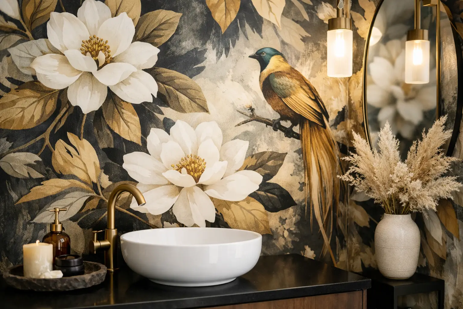
A powder room is often the smallest room in the house, yet it can leave the biggest impression. The right wallpaper for powder room walls turns a practical stop into a memorable design moment, whether your style leans classic, modern, moody, or playful. Because guests spend only a few minutes there, this is one room where a bold pattern, deep color, or unexpected finish can feel intentional rather than overwhelming.
The best results come from looking beyond the pattern alone. Wall condition, humidity, lighting, fixture finishes, and the scale of the room all affect how wallpaper will look and perform. A little planning helps you choose a design that is not only striking on day one, but also easier to install and maintain.
Why Powder Rooms Are Made for Wallpaper
Unlike a primary bathroom, a typical powder room does not have a shower or bathtub producing regular steam. That makes it a strong candidate for decorative wallpaper, including richer colors and detailed patterns that may feel too dramatic in larger spaces. It is also a manageable project for a homeowner who wants a high-impact update without committing to an entire living room or hallway.
Wallpaper gives this compact room texture and personality in a way paint alone sometimes cannot. A small-scale botanical can add softness around a pedestal sink. A geometric print can sharpen a contemporary vanity. A dark, large-format floral can make a windowless room feel intimate and tailored rather than cramped.
That said, powder rooms are not completely dry spaces. Hand washing creates occasional splashes, and poor ventilation can allow moisture to linger. Material selection and proper wall preparation still matter, especially around the sink and on walls that receive direct water contact.
Choosing Wallpaper for a Powder Room
Start with the room’s fixed elements. Look at the vanity color, countertop, mirror frame, faucet finish, flooring, and light fixture before narrowing down wallpaper samples. These details do not need to match exactly, but they should look considered together.
For example, warm brass fixtures pair naturally with ochre, olive, terracotta, cream, and warm neutral patterns. Chrome and polished nickel tend to suit crisp whites, charcoal, navy, cool green, and black-and-white designs. If the room has a wood vanity, choose whether you want the wallpaper to echo the wood’s warmth or create contrast with a cooler, cleaner palette.
Use Pattern Scale Intentionally
A common concern is that a large pattern will make a small room look smaller. Sometimes it will, but that is not always a problem. A powder room does not need to feel visually expansive. It can feel cozy, dramatic, or jewel-box-like, and a large print often helps create that effect.
Small patterns are a safer choice when the room has several visual interruptions, such as a large mirror, busy tile, open shelving, or a prominent window. They read as texture from a distance and keep the space from feeling fragmented. Medium and oversized patterns work especially well when the room has simple fixtures and relatively open wall areas.
Order samples whenever possible and view them on the actual wall. A pattern can look restrained in a product image and much more energetic once it wraps around four walls. Check it during the day and again with the vanity light on. Light bulbs can change the apparent undertone of both the paper and the paint on the trim.
Consider Color and Contrast
If the powder room lacks natural light, do not assume white wallpaper is the only answer. Deep navy, forest green, black, plum, or chocolate can make the boundaries of a small room recede, producing a polished, cocooning effect. Add a bright mirror, warm lighting, and a lighter ceiling to keep the result from feeling flat.
Lighter wallpaper is useful when you want the space to feel airy or when the vanity and floor are already dark. Cream, pale blue, soft green, and muted blush can bring calm without looking stark. High-contrast patterns are excellent for guest bathrooms, but balance them with simple accessories. One statement wallpaper, a clean mirror, and a well-chosen hand towel often look more expensive than a room filled with competing décor.
Pick a Material That Suits Real Bathroom Use
For most powder rooms, washable or scrubbable wallpaper is the practical choice. It allows you to gently clean fingerprints and minor splashes without worrying over every mark. Vinyl-coated and solid-vinyl options are popular for their durability, especially in homes with children or high guest traffic.
Nonwoven wallpaper is another strong option. It is stable, breathable, and often easier to install because many styles use a paste-the-wall method. That can reduce mess and make future removal more manageable. Performance varies by collection, so always check the manufacturer’s care and installation instructions before ordering.
Traditional paper wallpaper can be beautiful, but it demands more care. It is better suited to a well-ventilated powder room where the sink is not constantly splashing the surrounding walls. If you love a more delicate paper, consider using a coordinating painted backsplash area behind the vanity or installing a protective surface where water exposure is most likely.
Peel-and-stick wallpaper can be convenient for renters and quick updates, but it is not automatically the best choice for every bathroom. Adhesion depends heavily on wall texture, paint type, temperature, and moisture levels. A smooth, clean, properly cured painted wall gives it the best chance of success. Textured walls, dusty surfaces, fresh paint, or frequent humidity can lead to lifting seams over time.
Prep Matters More Than Most People Expect
Even premium wallpaper cannot hide a poorly prepared wall. Before installation, remove old adhesive, repair dents and cracks, sand rough patches, and clean the surface thoroughly. Grease, soap residue, and dust can interfere with adhesion, particularly near the vanity.
New drywall should be primed and sealed. Previously painted walls generally benefit from a wallpaper-specific primer, which creates a more uniform surface for adhesion and can make eventual removal easier. If the existing paint is peeling, glossy, or uneven, address that first rather than hoping the wallpaper will cover the issue.
Allow fresh paint and primer to cure according to product directions before hanging paper. Rushing this stage can trap moisture or weaken the bond. For a professional finish, also remove switch plates, outlet covers, towel bars, and the toilet tank lid if access allows. Those small steps make cuts cleaner and reduce the temptation to force paper around obstacles.
Installation Details That Create a Finished Look
Pattern matching is where a powder room project can become more complex than it appears. Calculate extra material for the repeat, especially with large florals, stripes, murals, or geometric designs. A straight-match pattern usually requires less waste than a drop-match pattern, but the product label will tell you what to expect.
Measure each wall individually, including the space above doors and around windows. Do not rely only on the room’s square footage. Narrow walls and cutouts can use more wallpaper than expected, and ordering an extra roll from the same dye lot is smart insurance against damage or future repairs.
Where possible, place the most visible pattern section behind the vanity or opposite the door. Avoid ending a narrow, awkward strip at the room’s main focal point. If the paper has an obvious directional design, double-check the orientation before cutting every panel.
Caulk is not a substitute for proper installation, but a neat paintable or clear edge treatment in splash-prone areas may be appropriate when recommended for the wallcovering and room conditions. Keep wallpaper edges away from standing water, and wipe splashes promptly with a soft, damp cloth using the care method specified by the manufacturer.
Finish the Room With the Right Paint and Lighting
Wallpaper rarely works alone. The ceiling, trim, door, and vanity color shape the final result. A crisp white trim can frame a colorful print beautifully, while a matching or near-matching trim color creates a more enveloping, designer look. For dark wallpaper, a painted ceiling in a softer related tone can add depth without making the room feel closed in.
Choose a quality bathroom-appropriate paint for surfaces that are not wallpapered. A durable, washable finish is helpful around doors, trim, and sink areas. If you are unsure whether a wallpaper’s colors lean warm or cool, bring the sample alongside paint chips and fixture finishes before making your final selection.
Lighting deserves the same attention. A single overhead fixture can cast shadows that distort a patterned wall. Sconces or a well-placed vanity light provide more flattering illumination and make darker papers feel purposeful. Use bulbs with consistent color temperature so the wallpaper looks the way you intended from morning through evening.
A powder room is a small project with outsized design potential. Choose a wallpaper that fits your home’s character, prepare the walls properly, and select installation materials that match the room’s conditions. Oui Colour Paint can help you pair wallpaper, primer, paint, and the tools needed to carry the look from sample to finished space with confidence.
